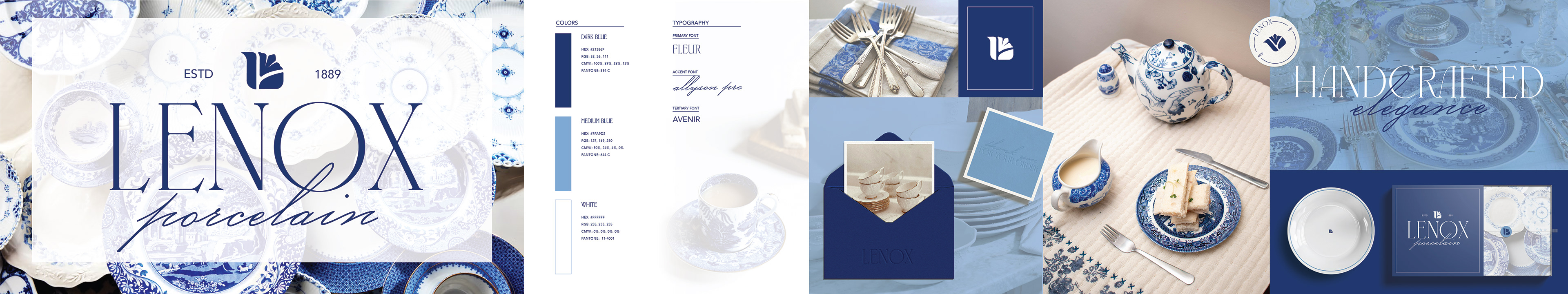
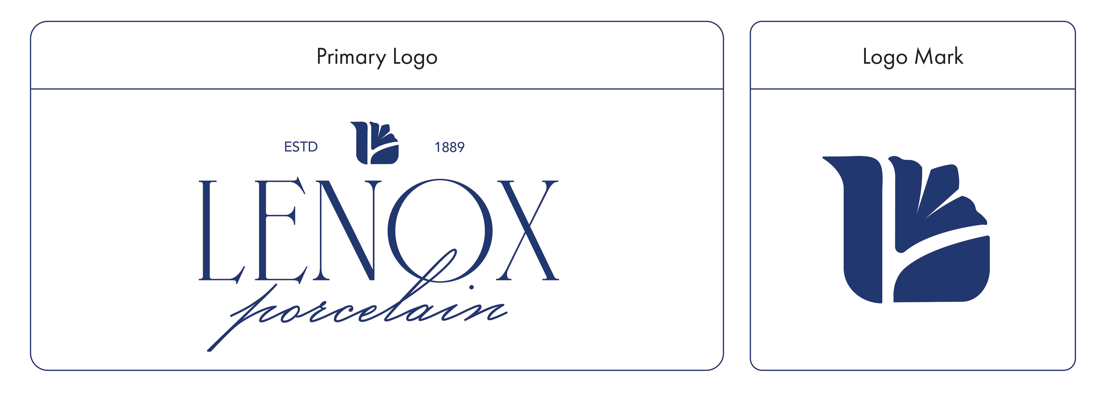
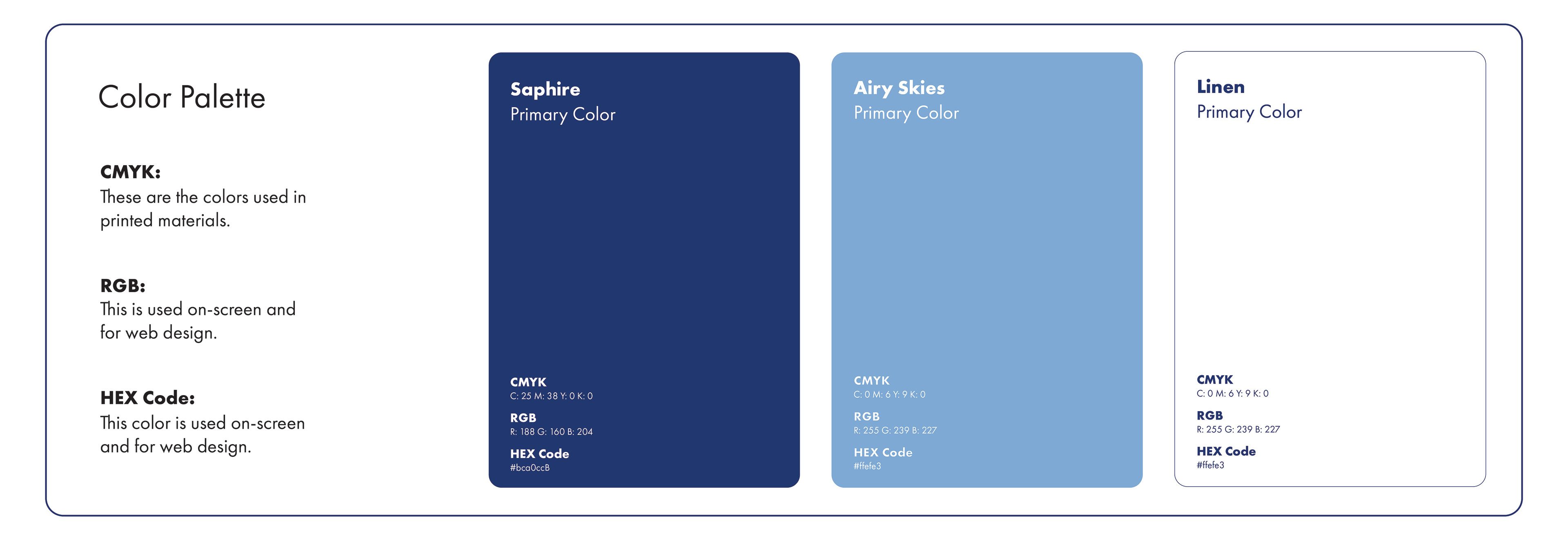
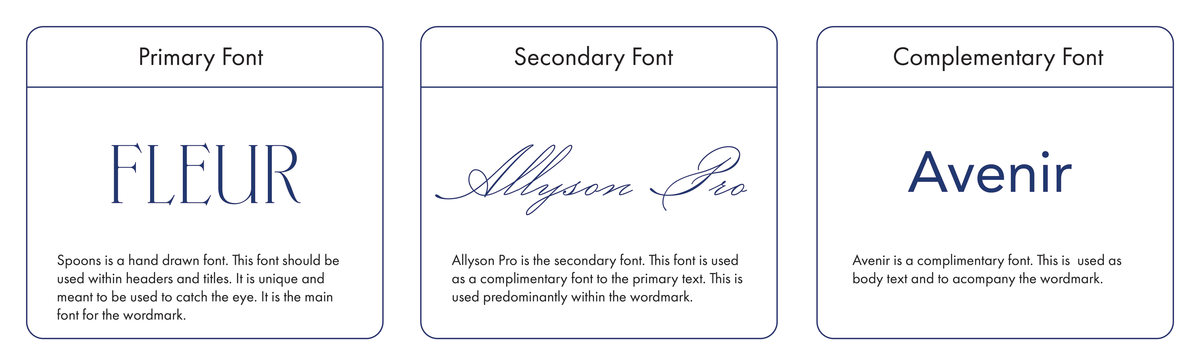
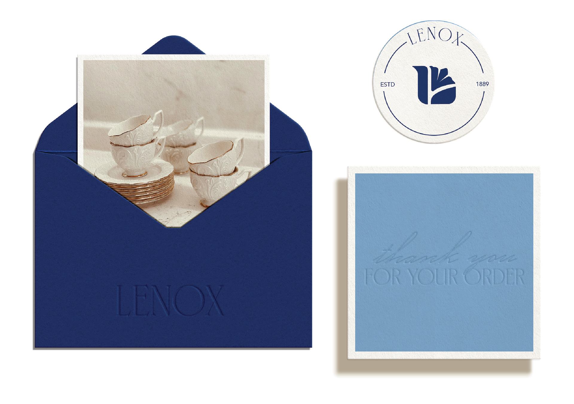
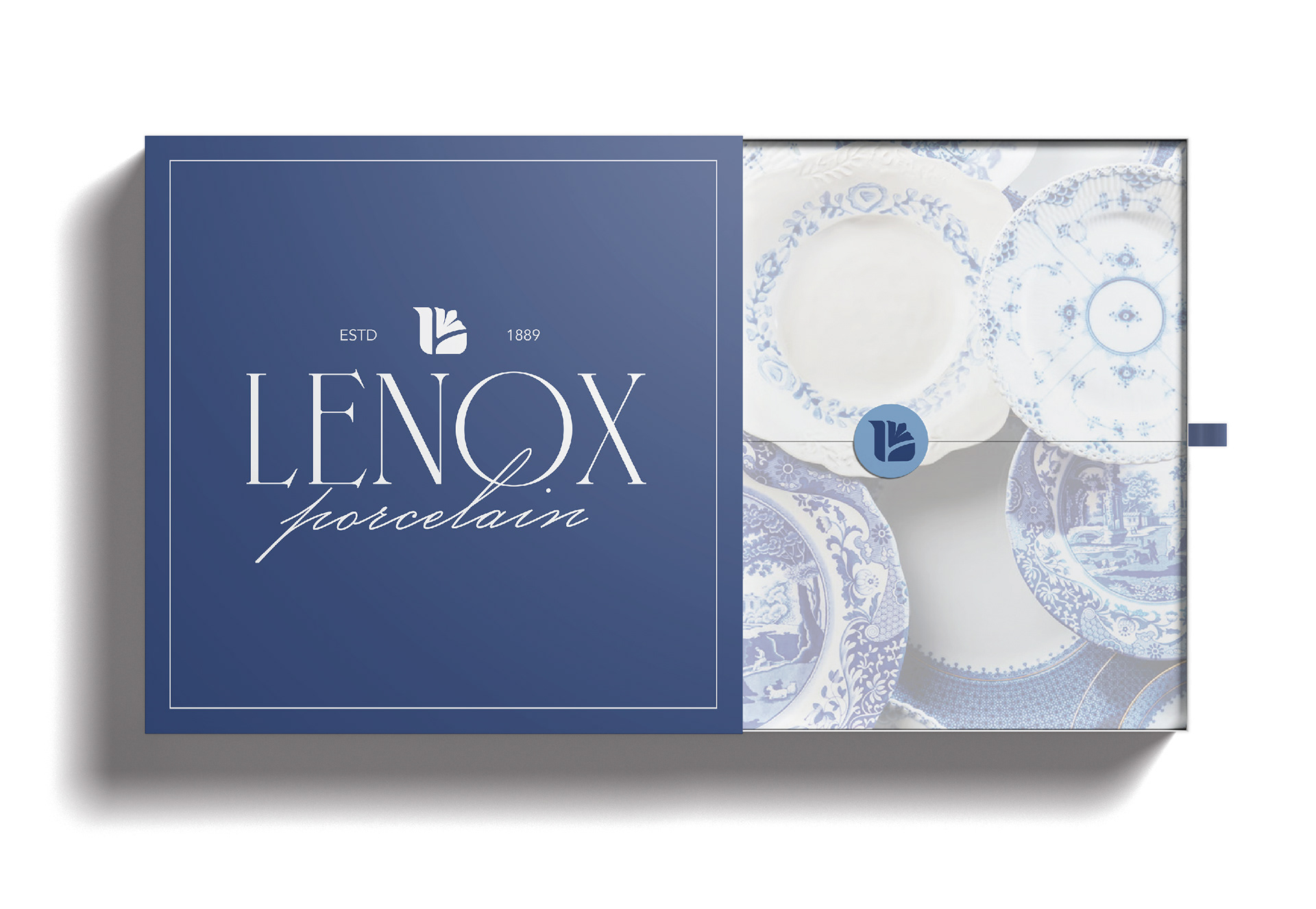
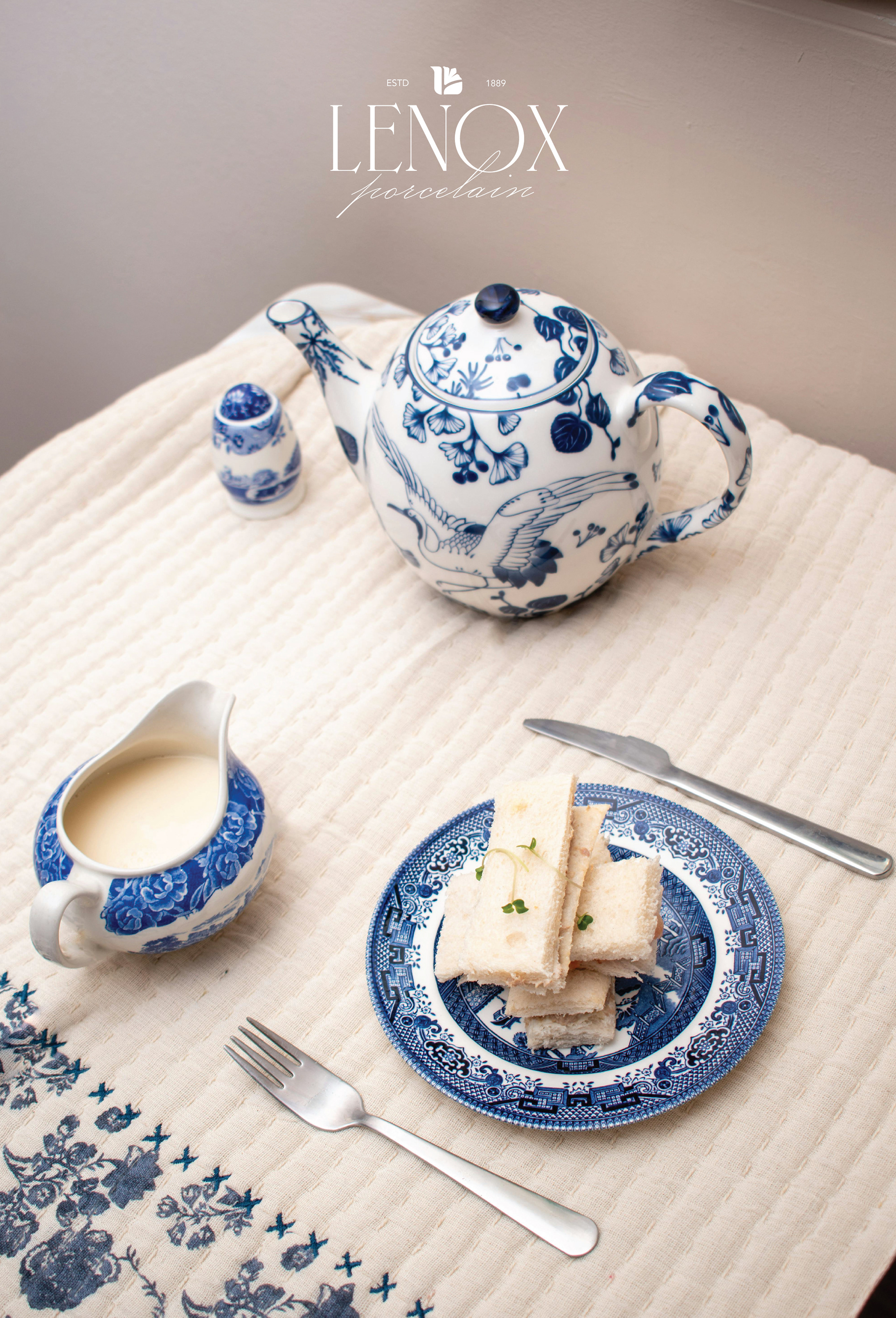
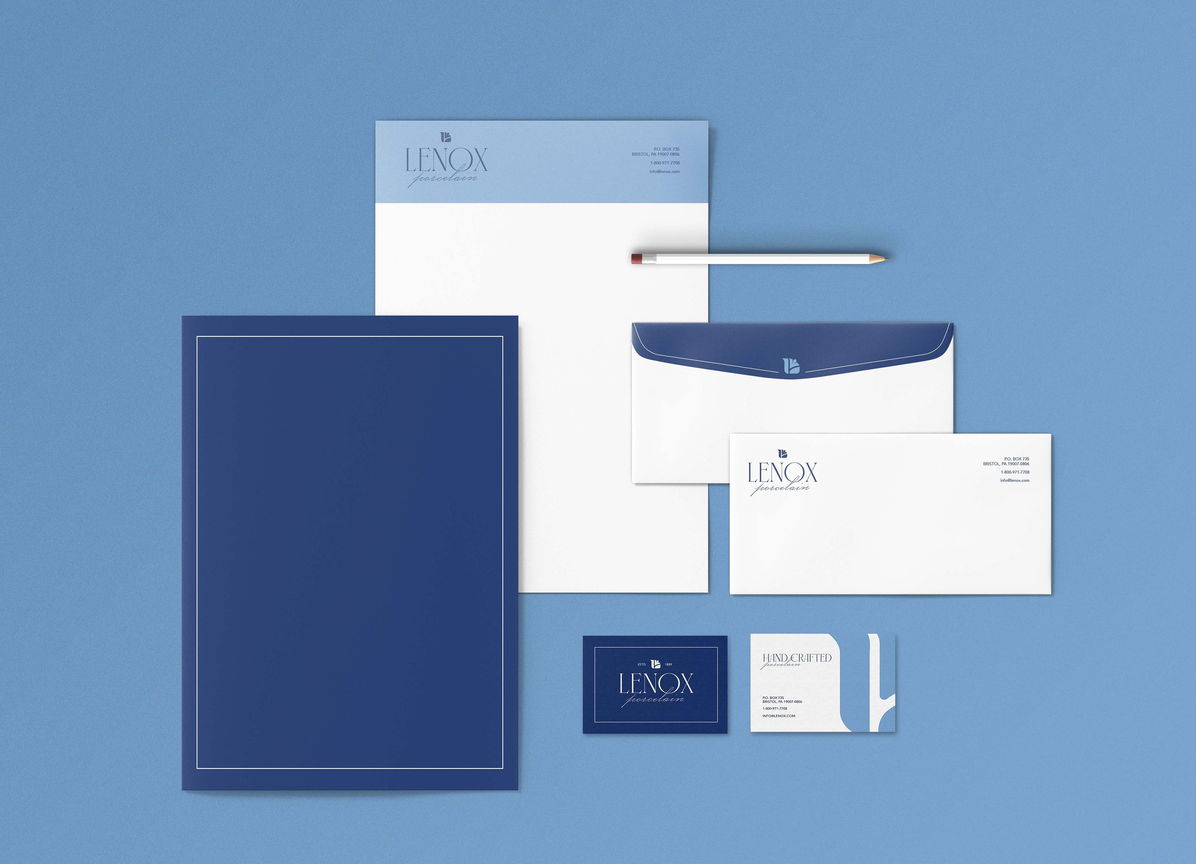
Lenox is known for their history, quality of craftsmanship and beauty of design. The current logo and brand assets do not reflect the intent of the brand. This project required a well thought out and intentional rebrand of a company whose current assets do not reflect their company's core messaging. In place of their current design I created a logo and brand identity that better reflects and symbolizes the design and elegance of their products. The rebranded main logo mark is a floral sawn in the shape of an ‘L’. This design is a symbol of timeless elegance and floral femininity while staying true to the Lenox name. Incorporating these three elements also add to the narrative of the brand, allowing consumers to dive into the meaning of the brand’s products. I chose a sophisticated type for the word mark and a color pallet that resembles traditional paint that would be used on bone china to create intricate designs.
The process for this project included a deep analysis of the current brand and logo. After this analysis I researched the history of the company, using keywords to frame my design. Overall, creating an updated design that still resonates with the brand.
Brand Implementation
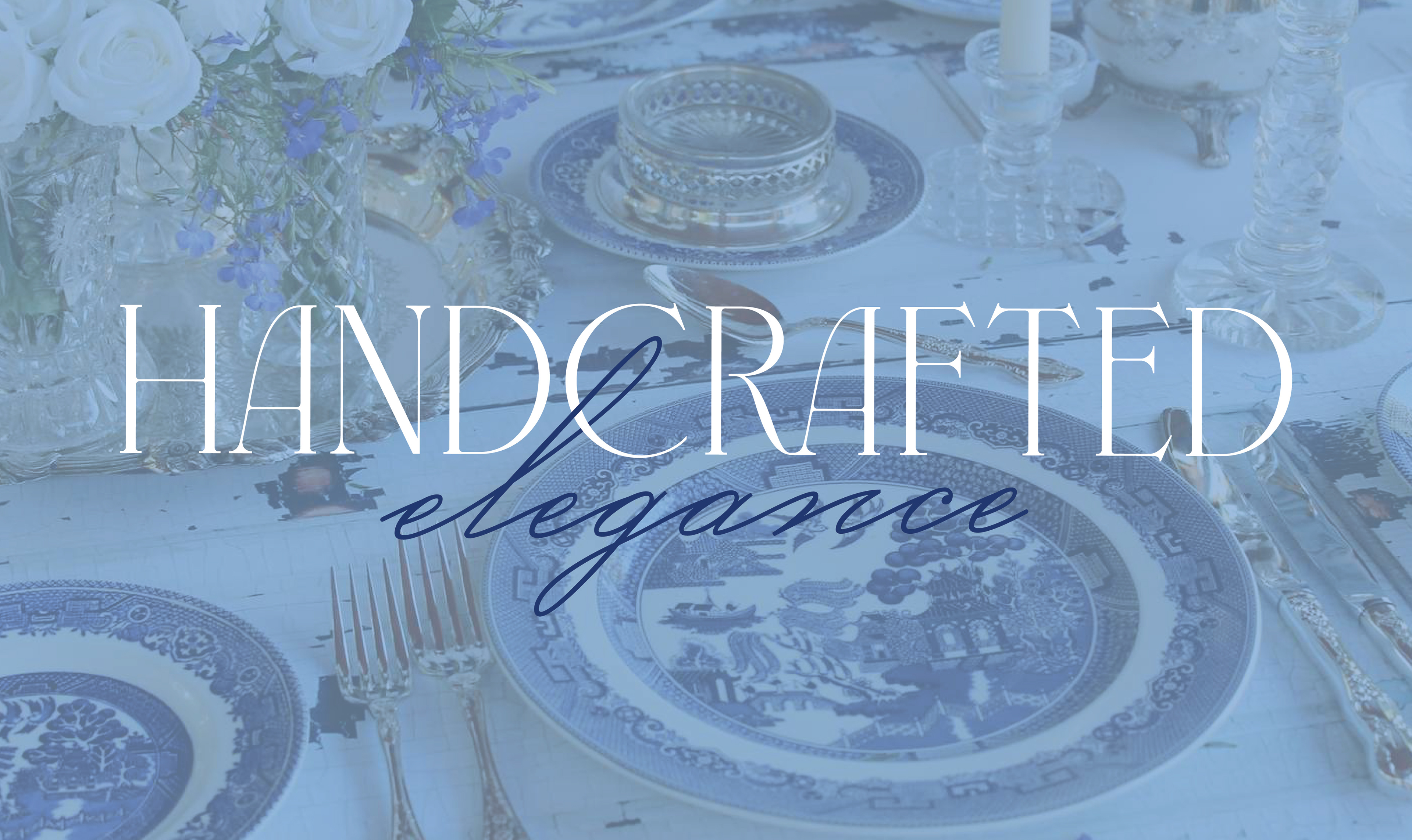


Stylescape